I have created this UX design portfolio checklist partly for selfish reasons to make my job as a design instructor easier. For the past two years, I have been getting the same question, “Is this work good enough for my UX portfolio?”
Also after a few years in design, I started reviewing portfolios to get experience with the interviewing process. Specifically at IBM as volunteer reviewers, we are all responsible for giving our reasons for accepting or rejecting a portfolio.
Considering my view from both ends of experience, I noted the following trends.
Insights from teaching students
- Nearly all of them do not have a clear idea of what a complete portfolio project looks like
- Most do not understand the importance of stepping the reviewers through their process
- Almost none of them think to validate the problem
Observations as a reviewer
- Most rejected portfolios DO NOT show a clear process
- Reviewers usually stop reviewing a portfolio when they are not convinced the problem is legitimate
But before I begin…
What is UX design?
UX (User Experience) Design is the discipline of enhancing a product for its users by helping them solve problems and meet their needs through refining usability, accessibility, and desirability. UX design draws on a number of perspectives that make up an experience. These include but are not limited to brand, business, environment, devices, packaging, retail, customer service, and back-end systems.
To learn more about the basics, checkout this article on Wikipedia. If you want to dig into the design principles that UX designers should follow, I’ve found this resource, Laws of UX helpful to align a team around design decisions.
Are you new to UX? I’d love to learn more about your experience getting into the industry. Take few minutes to fill out this survey.
UX design portfolio deliverables
Most students ask me if the work they have is enough for a portfolio piece. From the successful portfolios that I’ve reviewed for entry-level positions, they all included most of the elements below to tell a cohesive story. Reviewers quickly understood the problem, the intended user, steps to understand the situation, and the logic behind the solution.
1. Have you done a competitive analysis?

Example competitive analysis for Mobile App Project. You can look into different aspects of direct and indirect competitors to help determine how your product or service can stand out.
What is a competitive analysis?
How customers are currently solving their problems is a view into your competition. There are direct and indirect competitors. Direct competitors are those with similar products and services. Indirect ones are different products and services solving problems for the same target market. For example in the case of ride share services, Uber and Lyft are direct competitors. Personal vehicles and mass transit are indirect competitors to ride share companies.
You have to consider what makes customers choose one product or service over another. People factor in two to three reasons for choosing one product or service over another.
Customers may consider the following factors when deciding: price, benefits, quality, durability, brand, style, service, warranties, convenience, ease of use, number of features, type of features, wow factor, location(s), distribution and sales, certifications, and endorsements.

Here is a typical competitive analysis template where you can compare features or services across direct or indirect competitors. You can see which product/service offers more for customers.
From a UX design standpoint, you can focus on the ‘ease of use’ perspective. One product/service may be cheaper, but more difficult to use. How does this affect adoption and retention?

An example of a complexity analysis where I showed that one experience made the user go through 42 tasks and 7 context shifts.
2. Do you have a research outline, notes, and synthesis?

Research guidelines, Notes, and Synthesis
UX research in a nutshell
UX Research uses a variety of investigative techniques to build context and understanding that feed into the design process. At the start of a project, UX researchers focus on stakeholder alignment and uncover the needs of the users. Methodologies can fit into either one of two camps, quantitative or qualitative research.
Quantitative focuses on the statistically relevant numbers that can measure what users are doing. This helps understand what people are doing on a site, a product, or service.
Qualitative focuses on why people are doing (or not doing) certain things on a site, product, or service.
Common UX research methodologies for qualitative research:
Contextual inquiries, competitive analysis, diary studies, interviews, surveys, card sorts, tree tests, usability studies, and A/B tests.
UX research methodologies to potentially include
- Diary studies – Participants of the study record a diary or journal about their activity related to the focus of the study. The researchers collect data over a period of a few days to a several months.
- Interviews (directed, non-directed, and ethnographic) – This is a common method of learning about the users. Researchers can approach this a variety of the following types of interviews.
- Surveys – These are an easy way to gather a large amount of data from a group. This is a great option to get a broad understanding of a diverse group. One of the downsides of surveys is the participants have to interpret the wording of the questions on their own. This can affect the responses or even survey completion.
- Card Sorts – When the researcher needs to understand how users interpret the relationship of content groupings and hierarchies, they can use this technique as a part of an interview or usability study. This method helps test assumptions on hierarchy and jumpstart work on Information Architecture (IA).
- Tree Tests – Tree tests show if the results of a card sort are congruent with how users find content on sites or products. Participants must complete a task at the top of a site map. Researchers ask where the user will go to complete that task.
- Usability studies (moderated or unmoderated) – To help the team determine the ease of use of a product or service, participants (potential or current users) attempt to complete a set of tasks on a prototype or live code. There is a variety of approaches, but they mostly fall under either moderated or unmoderated.
3. Have you identified your target audience?

This is an empathy map to identify the right user, her motives, and opportunities for help.
- Archetypes or Personas – Personas help the team focus on one representation with information like gender, age, scenarios, goals. Archetypes focus on behavior (i.e. savor, task centric, or identity focused).
- Empathy maps – The first step in design thinking assist the team in vizualizing what the user is thinking, saying, feeling, and doing during specific points in their journey.
- Storyboards – These are like comic strips that outline the user’s actions and situation. The goal is to help the team understand where the problem and potential solution(s) arrive in the user’s world.
- Journey maps – Journey maps are show specific steps on a timeline the user takes, interactions with the product / service, and relationship with systems. This helps identify potential blockers and opportunities for improvement.
4. Have you explored solutions?

Whiteboarding and Paper Prototyping. This is an example of collaboratively working through initial ideas to understand mental models and concepts.
- User flows – This is a diagram that shows the steps the user takes to complete a task in the product.
- System maps – System maps show the hierarchy in relation to the navigation and page views.
- Wireframes – Either in low or hi-fidelity, wireframes show the content, layout, and interactions the user can take on a specific page view.
- Prototypes – Prototypes can be in either low or hi-fidelity. They should show enough fidelity with the data to help the user understand the context.
- Usability study – Test your work with users. Show the results and the lessons learned.

System Maps help the team understand where the screens, workflows, and interactions all fit within a system of navigation, accounts, notifications, etc..

Hi Fi Wireframes and Annotations. When you are confident with general flows, you can focus on micro interaction. Writing out these will help you think about logical system behaviors.

Testing concepts and ideas with a prototype during a usability session. Have your participant talk through the interactions and choices.
5. Have you invested in the UI design portfolio elements?
The next step is to think about the visual design elements of your case study. This includes the choice of colors, type, grid, hierarchy, how they are used with a brand, and how they are integrated with the interactions. Together these elements become the UI or User Interface.

Exploring a visual language and it either enhances the experiences or muddles it
What is UI design?
UI design is a critical subset of UX design. If UX design includes the end-to-end experience of a product or service, then UI design focuses on the interactions the user will have with design elements. UI designers need to understand how design elements such as hierarchy and color influence user. Do they help users move along an intended path or block them?
Here are the minimum requirements for rounding out a solid UX design portfolio with core UI design considerations.
- Hierarchy – Map out the focus of each page views. Start with the key content areas at the top left. Use them to guide the users to the next action.
- Color – Leverage color to reinforce the brand. Avoid over using it and find a balance with the content and intended actions.
- Type – Typography influences hierarchy and how users consume content. Like color, designers can mix styles and clash elements that can overwhelm users.
- Grid – How do these UI elements fit together on a full-width or mobile view? How do you maintain hierarchy and readability as the screen sizes shift?

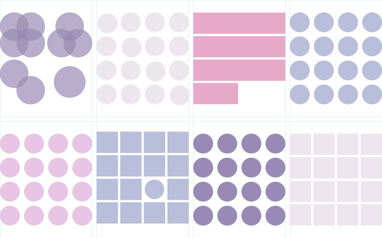
Experiment with color to understand its effect on balance and interactions

Studying typography for readability, hierarchy, and contrast
Closing thoughts on deliverables
Applicants do not need all of these, but they need enough of this work and visual artifacts to tell a cohesive story. I hope this guide will help applicants understand the required effort to create a cohesive portfolio project. These examples should help you level set the work you have now and outline the gaps you need to fill.
Related posts for getting started in UX design
- How to learn UX design from the beginning
- Books every UX designer should read
- Starting out as a UX design generalist
- Top 10 UX design portfolios done right
- Struggles of getting the first UX design job
Are you new to UX? I’d love to learn more about your experience getting into the industry. Take few minutes to fill out this survey.
[vc_cta h2=”Get Updates and Insights in your Inbox ” add_button=”right” btn_title=”Sign up” btn_color=”purple” btn_size=”lg” css_animation=”fadeIn” btn_link=”url:http%3A%2F%2Ftapswipeclick.com%2Findex.php%2Fux-bender-newsletter-sign%2F|||”]Working hard to bring the latest on the UX Industry to you. Sign up for interviews, recommendations, insights and tips to your inbox.[/vc_cta]
Sign Up Today
Get insights and resources in your inbox before I publish them!